Numbers can also be added like the shortcut marker on an icon:
(placed at the bottom left slightly overapping the icon)
Attachment:
ie-icon-shortcut.JPG [ 2.5 KiB | Viewed 7376 times ]
Attachment:
version3-new.jpg [ 1.55 KiB | Viewed 7375 times ]
| coollector.com https://www.coollector.com/ |
|
| string search within owned movies https://www.coollector.com/viewtopic.php?f=1&t=574 |
Page 3 of 3 |
| Author: | (cool) Hector [ Fri Mar 18, 2011 3:10 am ] |
| Post subject: | Re: string search within owned movies |
I realize that I already have most of the needed icons. How would you visually marry those icons with the numbers ? P.S: time for me to go to bed. See you tomorrow. |
|
| Author: | kakashi [ Fri Mar 18, 2011 5:14 am ] |
| Post subject: | Re: string search within owned movies |
These are just a few rough ideas using paint and fading out the text. There are many cooler ways (would take more time and a proper program) P.S. I cant use your icons right now. It takes time to lift them off their bg with paint. OLD: NEW: a few more possibilities: Bear in mind the completed ideas would be much better done. Depending on how good the icons carry off the intended message the faded text could even be removed and replaced with descriptions only when you hover over them. |
|
| Author: | kakashi [ Fri Mar 18, 2011 5:34 am ] |
| Post subject: | Re: string search within owned movies |
Numbers can also be added like the shortcut marker on an icon: (placed at the bottom left slightly overapping the icon) Attachment: ie-icon-shortcut.JPG [ 2.5 KiB | Viewed 7376 times ] Attachment: version3-new.jpg [ 1.55 KiB | Viewed 7375 times ] |
|
| Author: | (cool) Hector [ Fri Mar 18, 2011 12:39 pm ] |
| Post subject: | Re: string search within owned movies |
Thank you very much for the time you've spent drawing those sketches. kakashi wrote: One of coollector's major strongpoints is that it has a clear, minimal and simple looking interface even though it has so many features. I'm very surprised by your propositions. Before all, they take up a huge amount of vertical space. In comparison, my menu bar looks minimal and elegant. |
|
| Author: | kakashi [ Fri Mar 18, 2011 12:51 pm ] |
| Post subject: | Re: string search within owned movies |
yeah, couldn't do any thing smaller with paint. If you notice your actual images are much smaller. (Maybe just a bit taller than the menu bar) but you get the layout idea though? |
|
| Author: | kakashi [ Fri Mar 18, 2011 1:06 pm ] |
| Post subject: | Re: string search within owned movies |
Actual sizes should be more like: Attachment: menu.jpg [ 6.56 KiB | Viewed 7359 times ] ...or less you could also give user choice of text icon or both. |
|
| Author: | kakashi [ Fri Mar 18, 2011 1:16 pm ] |
| Post subject: | Re: string search within owned movies |
I kinda like the size menu you used here 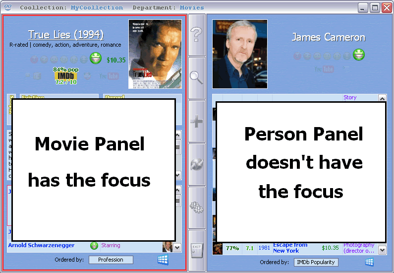 ] ]The icons worked together (so it didn't seem crowded) As a matter of fcat I think the numbers would look pretty good added to a rotated version of this type menu |
|
| Author: | (cool) Hector [ Fri Mar 18, 2011 1:37 pm ] |
| Post subject: | Re: string search within owned movies |
It's urgent that I release Coollector version 3. It'll have the interface that I've shown, because it's already coded. Now, I need to go back to work on the remaining parts. Later we'll see how I can improve the menu bar. Thank you very much for your involvement ! |
|
| Author: | kakashi [ Fri Mar 18, 2011 4:18 pm ] |
| Post subject: | Re: string search within owned movies |
NP |
|
| Author: | (cool) Hector [ Fri Mar 18, 2011 4:37 pm ] |
| Post subject: | Re: string search within owned movies |
I think that I'll propose a choice in the settings: 1) no icon 2) small icons 3) big icons And everyone will pick what he prefers. |
|
| Author: | kakashi [ Fri Mar 18, 2011 6:21 pm ] |
| Post subject: | Re: string search within owned movies |
Kool, Ill be going with big ones, I have lots of screen space |
|
| Author: | (cool) Hector [ Fri Mar 18, 2011 7:14 pm ] |
| Post subject: | Re: string search within owned movies |
And me I'll choose without icon. Everybody will be satisfied |
|
| Author: | kakashi [ Fri Mar 18, 2011 9:54 pm ] |
| Post subject: | Re: string search within owned movies |
(cool) Hector wrote: Thank you very much for the time you've spent drawing those sketches. kakashi wrote: One of coollector's major strongpoints is that it has a clear, minimal and simple looking interface even though it has so many features. I'm very surprised by your propositions. Before all, they take up a huge amount of vertical space. In comparison, my menu bar looks minimal and elegant. This is just to clear my name. Does the window frame serve an actual purpose? (cool) Hector wrote: they take up a huge amount of vertical space My design is now much shorter (with the use of a little imagination) than yours |
|
| Page 3 of 3 | All times are UTC + 1 hour [ DST ] |
| Powered by phpBB® Forum Software © phpBB Group http://www.phpbb.com/ |
|