Page 1 of 3
Icons
Posted: Sat Mar 19, 2011 11:59 am
by kakashi
Any Images I upload here were made by me, you can do what you want with them...
Close:
The attachment close.png is no longer available
Playable:
The attachment play.png is no longer available
Rated:

- play.png (35.39 KiB) Viewed 6869 times
Re: Icons
Posted: Sat Mar 19, 2011 12:40 pm
by (cool) Hector
Kakashi, I really appreciate your commitment, but I'm afraid that you are wasting your time.

I don't need a "close" icon, and I already have the icons for "playable", etc...
Also, such big icons are completely useless. The main difficulty with icons, it's to get small icons that look crisp and sleek.
Re: Icons
Posted: Sat Mar 19, 2011 1:43 pm
by kakashi
These are actually the first icons I've ever made. I've always wanted to learn but never knew what to make.

For me its just another learning experience. I'll need practice for building my own icons.
As a learning procedure i tried to see if i was able to copy your playable icon (it worked

) so I went on to practice on a few of my own. hence:
kakashi wrote:Any Images I upload here were made by me, you can do what you want with them...
(cool) Hector wrote:Also, such big icons are completely useless. The main difficulty with icons, it's to get small icons that look crisp and sleek.
Dude, they're scalable.
icons.png
The main thing that matters is that i now know how to make (and scale) icons.
")
These are my first. I'll prob be a lot better by the time I actually NEED icons.
Re: Icons
Posted: Sat Mar 19, 2011 1:47 pm
by kakashi
You really need to relax a bit more...
Re: Icons
Posted: Sat Mar 19, 2011 1:57 pm
by (cool) Hector
kakashi wrote:For me its just another learning experience. I'll need practice for building my own icons.
Ok, I understand better.
kakashi wrote:Dude, they're scalable.
Indeed, they seem to scale nicely. They look even better.
How do they look in 16x16 and 32x32 ?
Re: Icons
Posted: Sat Mar 19, 2011 2:07 pm
by kakashi
Size test...
16:

- 16.png (848 Bytes) Viewed 6848 times
32:

- 32.png (2.02 KiB) Viewed 6848 times
48:

- 48.png (3.75 KiB) Viewed 6848 times
16 seems hardly click-able... It's pretty small compared to what you're using now.
Re: Icons
Posted: Sat Mar 19, 2011 2:20 pm
by (cool) Hector
kakashi wrote:16 seems hardly click-able... It's pretty small compared to what you're using now.
Coollector's icons are all 16x16 and 32x32.
16x16 is used in grids and in the icon panel.
Re: Icons
Posted: Sat Mar 19, 2011 2:23 pm
by (cool) Hector
kakashi wrote:16 seems hardly click-able...
For the menu, you won't have to click precisely on the icon.
Re: Icons
Posted: Sat Mar 19, 2011 2:27 pm
by kakashi
Just noticed. I was looking at the play icon. I forgot that it gets bigger when i hover.
Also bear in mind that using custom icons means you can use virtually any size you feel like, 16, 18, 20, 22, 24 ... (anything that feels right to you)
(cool) Hector wrote:For the menu, you won't have to click precisely on the icon.
OK
Re: Icons
Posted: Sat Mar 19, 2011 2:31 pm
by (cool) Hector
kakashi wrote:Also bear in mind that using custom icons means you can use virtually any size you feel like, 16, 18, 20, 22, 24 ... (anything that feels right to you)
Of course. Coollector's icons are custom icons. They were made specifically for Coollector.
Now that I have settled for those two sizes, I must stick to them, or that would look weird.
Re: Icons
Posted: Sun Mar 20, 2011 12:03 am
by kakashi
.
Re: Icons
Posted: Sun Mar 20, 2011 12:09 am
by kakashi
Wow, i thought 32x32 was much smaller than this:
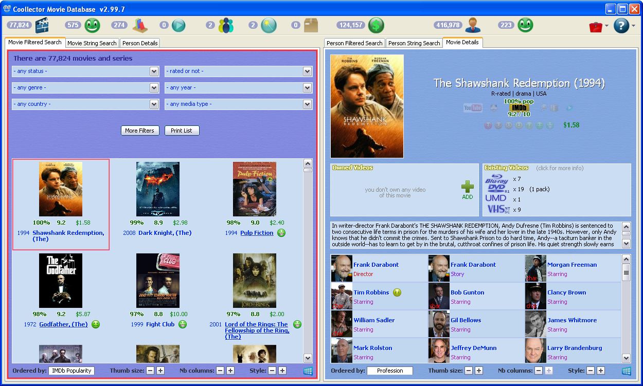
- Capture.JPG (209.3 KiB) Viewed 6793 times
I now see why you chose those sizes
(this is just a lower quality screenshot, the real image is over the 256Kb limit)
Re: Icons
Posted: Sun Mar 20, 2011 3:13 am
by kakashi
.

- icons.png (50.51 KiB) Viewed 6794 times
Re: Icons
Posted: Sun Mar 20, 2011 5:19 am
by kakashi
I suppose all the icons you would need are now accounted for?
Re: Icons
Posted: Sun Mar 20, 2011 7:33 am
by kakashi
http://www.coollector.com/viewtopic.php?f=1&t=574&start=30You asked how to visually marry the numbers and icons.
My answer:
By sticking to lightly colored, smooth and relatively curvy icons (since the numbers are already light and smooth and with circular edges). As long as this is done and all the icons work in harmony with each other then it looks good.